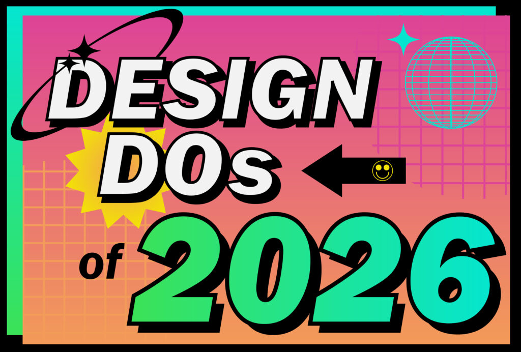
We at IH Concepts are taking 15 design blogs and sources’ trends into the upcoming year with us. Specifically, after doing thorough research and diving into several sources, we’ve rounded up 15 design choices that are on track to be popular amongst designers, publishers, and creatives everywhere. Let’s get into it!
1. Scrapbook/Scissor Works
Scrapbook/Scissor Works style font has a very natural and organic look. Imagine taking a pair of scissors to a magazine or newspaper, cutting out individual letters, and using these letters to form a message. Not only is this font creative, but it is organic, playful, and packed with personality while simultaneously also providing an almost nostalgic feel.
2. Hero Characters
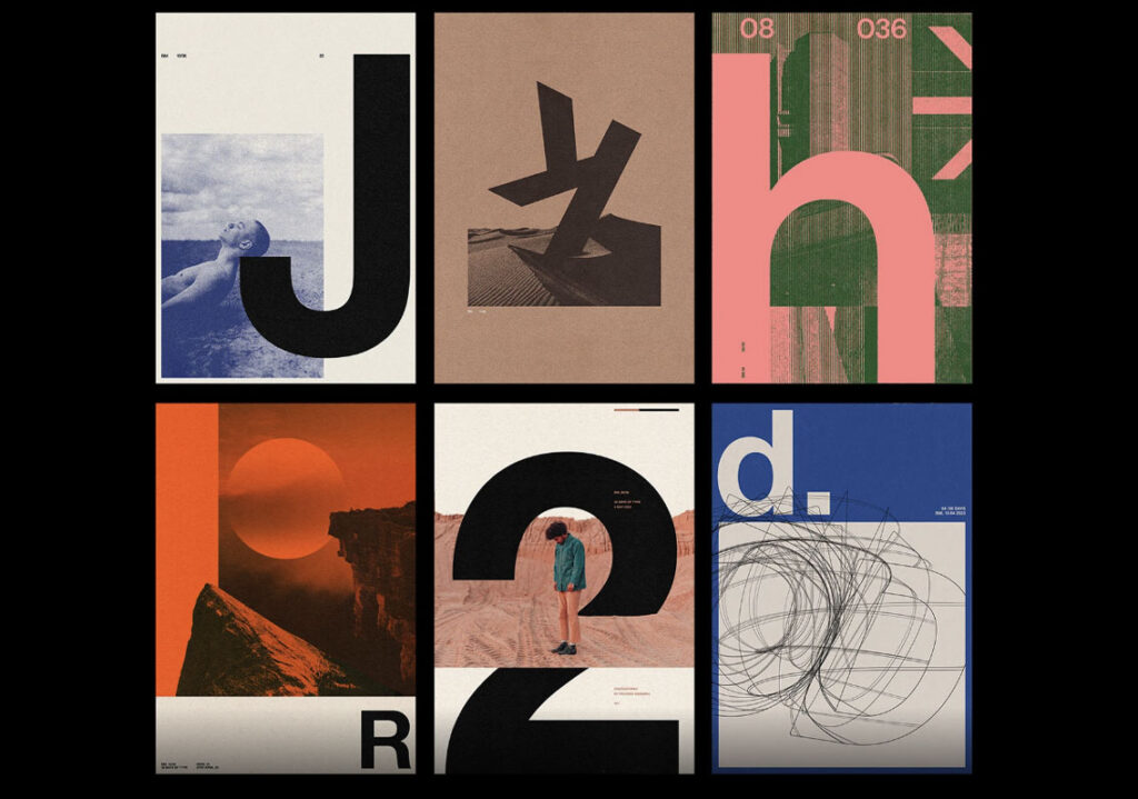
Hero characters take one single letter from a brand’s message or title, supersize that letter, and style the letter with a font differing from the rest of the message. Singling out a letter treats it as sort of a “hero” or “star of the show” by showing it off as dramatic, confident, and impossible to ignore.
3. Neo-Minimalistic, Obsidian
Two styles, both simplistic and impactful.
Neo-Minimalism: A clean, contemporary design that puts emphasis on its texture and detail. More specifically, neo-minimalism is simple yet has flare. There are great expectations for neo-minimalism this year as, according to Grace Fussell of Envato, minimal design searches increased by 7.6% recently each day.
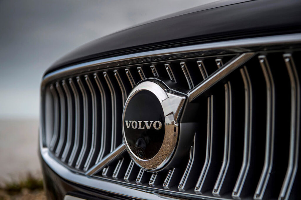
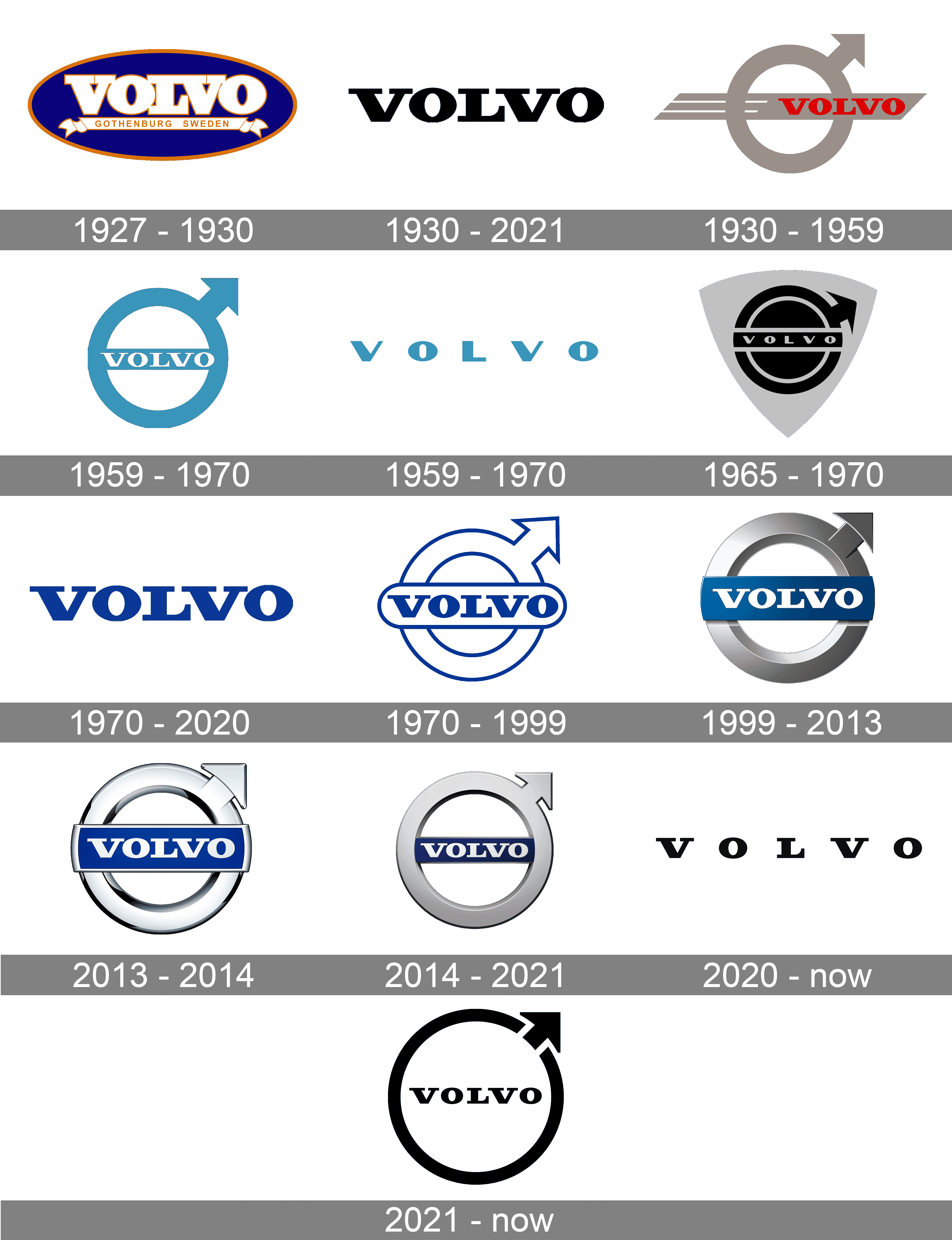
Obsidian: Like neo-minimalism, obsidian more heavily uses black-and-white whereas neo-minimalism is more likely to use color. A great example of this? Volvo, the luxury vehicle brand. Over the years, Volvo has mainly incorporated blue within their logo, whereas more recently, it transitioned to a more striking black-and-white loo. Pictured above, we can see Volvo’s growth and more recent commitment to using black and white illustrates luxury through simplicity.
4. Bronze Age
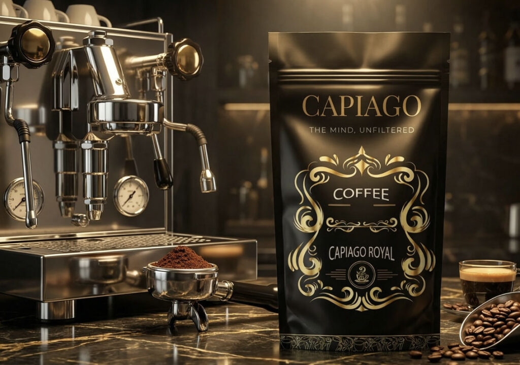
Think metallic warmth without the flashiness of gold. Bronze Age exudes metallic tones that feel grounded and sophisticated, as explained by Philip VanDusen of “12 Graphic Design Trends for 2026” on YouTube. This style is both bold and refined.
5. Billboarding
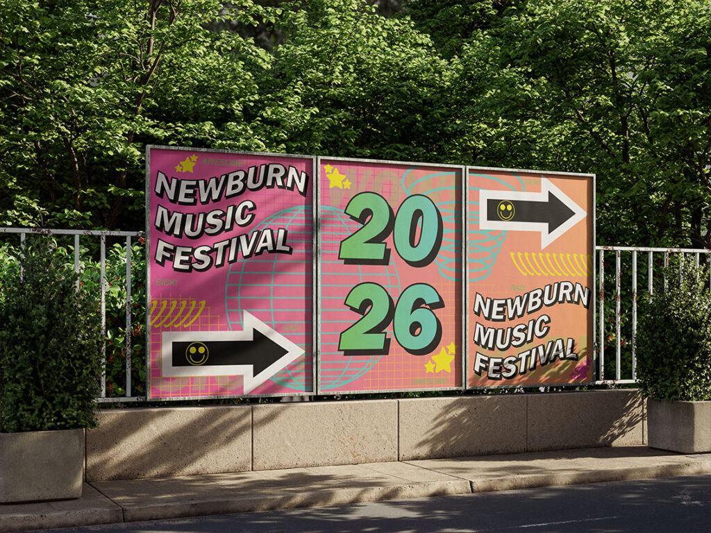
Billboarding is all about repetition with intention. This style creates a design in multiples, with each aspect within the message relating to one another, whether that be through color, illustration style, or another factor. Remember, when styling a design with Billboarding, consistency is key.
6. Bright Colors Making a Comeback
Color is turning up the volume again in three particular ways.
Acid Fade: Has smooth transitions and psychedelic tranquility, while also appearing youthful, optimistic, and rebellious (VanDusen). The bright colors of Acid Fade are meant to catch the attention of the viewer, while still being easily readable.
Saturation Revival: Involves using bold, bright, oftentimes neon, colors within design to create a long-lasting, optimistic feeling for the audience. This type of style is especially useful for social campaigns, festival/event branding, youth-oriented products, fashion/beauty, and creative tech, as explained by Fussell.
Neon-Noir: Tends to take an overall dark design and adds a pop of color, oftentimes this color being red. Neon-Noir is especially common in Japanese street culture and noir cinema to create a darker, sharper feel according to the article “Top 10 graphic design trends 2026” by Vistaprint.
Bright colors are making a comeback with a bold twist!
7. Tech Spec
Precision meets personality. Tech Spec style involves tracking grids, pop color accents, and can be thought of almost looking like something directly out of a science lab. Tech Spec embraces the totalitarian design aesthetic and created with an engineered precision. It is structured, controlled, and unapologetically technical.
8. Affinity
Affinity has a friendly, rhythmic look, with the intent to look emotional without being too childish. Affinity is thought to go against cold tech aesthetics often associated with artificial intelligence, by bringing an emotional feel without being too childish to the message being communicated. Picture a human-centered design that is polished and modern.
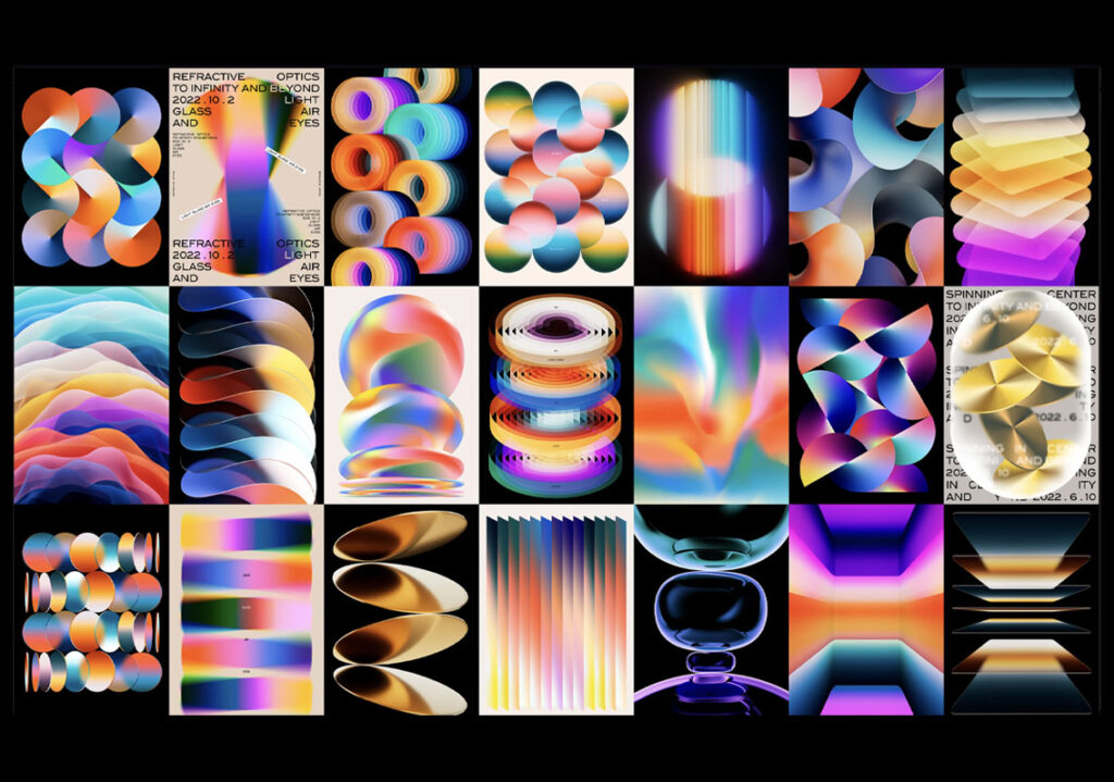
9. Translucence
Translucence brings together transparent layers and visual depth without being completely three dimensional. It has the goal of storytelling through its layers by having the audience complete the image mentally. It’s modern, meaningful, and visually intriguing.
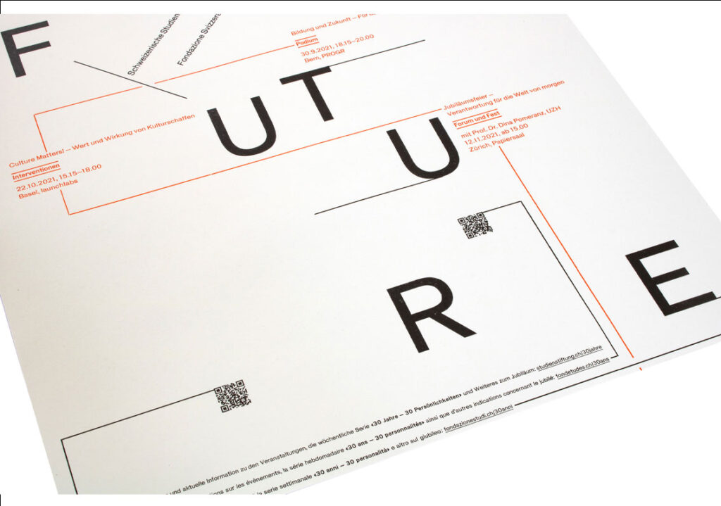
10. Brute Force
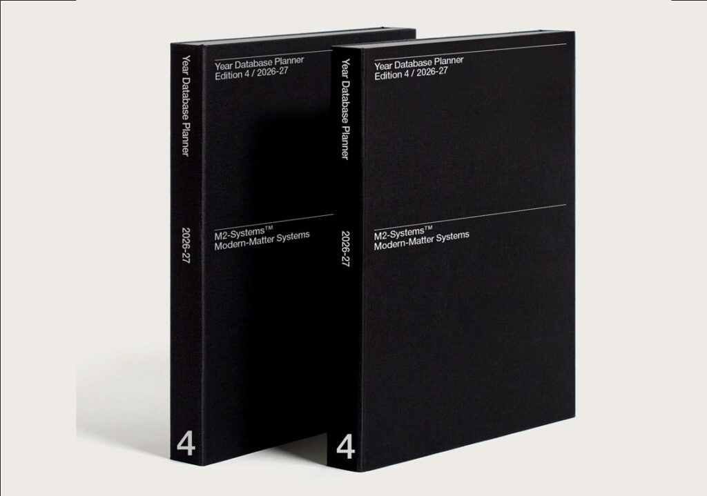
Brute Force involves the usage of heavily stacked typography and spreadsheet style grids. This style lacks a large color scheme, mainly using the colors of black and white to give off the impression of being sophisticated, grounded, and blunt. Oftentimes found in art institutions and editorial designs, brute force gives the feeling of being bold, intellectual, and unapologetically direct.
11. Punk/Grunge
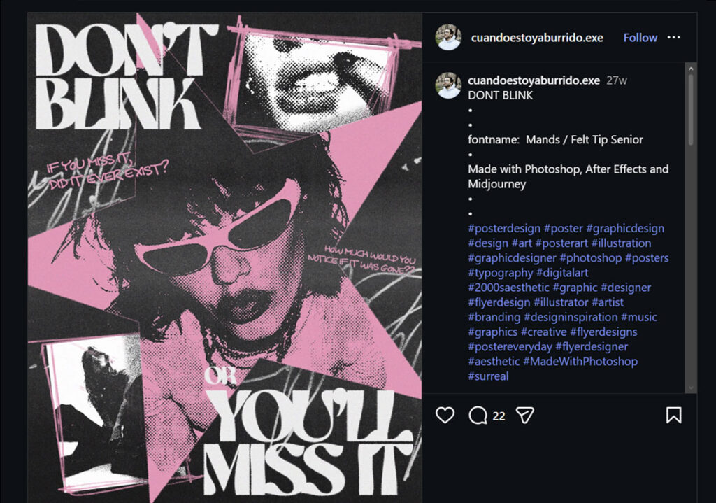
The Punk/Grunge style gives off the feeling of being deliberately raw, textured, and intentionally imperfect. Think back to 90’s zines and alternative rock albums that were popular back in the day. These cut and paste collages define the Punk/Grunge style by giving its own unique aesthetic.
12. Blueprint Design
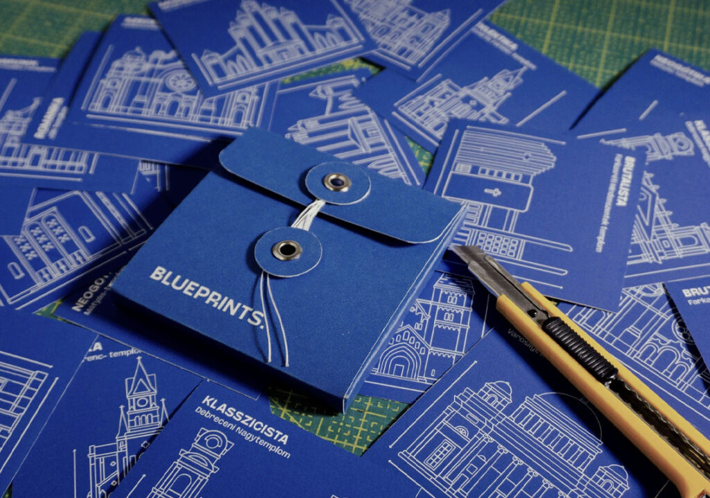
Blueprint Design is exactly how it sounds; breaking down everyday objects into precise diagrams. This style relies on detailed line drawings, grids, and annotations to communicate the message. It is technical, thoughtful, and methodical, as if being able to peek behind the curtain to see how things work.
13. Trinket Design
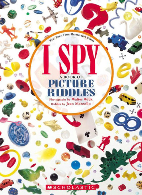
Trinket Design involves the act of collecting as a design itself. Objects are carefully arranged, such as being positioned symmetrically, floating, side-by-side, or catalog-style. Think of the cover of the popular I Spy photographic children’s books by Jean Marzollo. As shown above, these covers heavily use the concept of Trinket Design. Every tiny object adds to the story.
14. Candid Camera Roll
Grainy film. Flash photography. Real-life moments.
Images feel warm and more humanized versus those that follow a specific design aesthetic. This way takes the viewer into a story being told through pictures but simultaneously gives off a sense of nostalgia by these warm, familiar images.
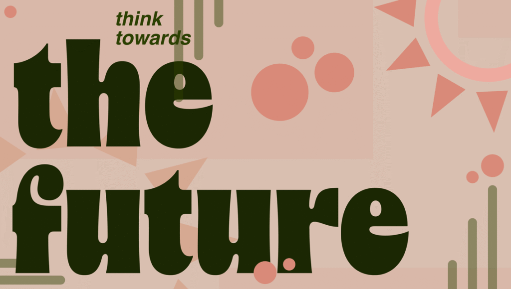
15. Retro Futurism
Why choose between past and future when you can have both? Retro Futurism blends nostalgia with imagining what is next to come. In fact, Bussell explains that the interest in 80s themes has had an 83.7% rise in daily search recently. Retro-Futurism brings a playful, forward-thinking style that allows its users to honor what was and what is to come.
Final Thoughts
Design in 2026 is centered around personality in more ways than one. Whether it be through bold color, nostalgic texture, engineered precision, or striking simplicity. One point is certain: creativity will only continue to expand this year and years to come.
Sources
https://1000logos.net/wp-content/uploads/2020/03/Volvo-Logo-history.png
https://www.barnesandnoble.com/w/i-spy-jean-marzollo/1100569212