
Have you ever clicked into a website and left within seconds because you couldn’t find what you needed? Many users leave not because of poor content but because they feel lost. When visitors cannot understand where to go next, they leave quickly and often never return.
Websites with optimized UI and UX can see up to a 400% increase in conversions compared to poorly designed ones. That statistic alone shows how design decisions directly influence user behavior and business results.
Clear navigation is one of the strongest tools to keep users engaged and guide them toward meaningful action. Website navigation design gives structure to your site and builds trust with your audience. It determines how visitors move through content, how easily they locate information, and how smoothly they reach their goals.
When navigation works, users spend more time exploring, understanding, and connecting with your message. Here’s how thoughtful navigation design improves the way users experience your website.
What Is Website Navigation Design?
Website navigation design refers to the system that allows visitors to move through your site with ease. It connects pages, organizes content, and shows how information relates to other sections. In many ways, it is the digital map of your business.
Strong navigation design combines layout, labels, and hierarchy to help users understand where they are and where they can go. It blends information architecture and user experience principles to create a structure that feels natural and consistent. When navigation is intuitive, visitors do not have to think about how to use the site. They simply move toward what they need.
Why Website Navigation Design Matters

Picture this: you have been searching for a new bag for weeks. After browsing several designer websites, you finally find one that feels perfect. You are ready to purchase, but when you try to check out, the “Checkout” button is nowhere to be found.
After a few minutes of searching, the excitement fades. You leave the site and buy from another brand instead.
This is where many businesses lose potential customers. Poor navigation makes the process confusing and frustrating, no matter how strong the product or message may be.
Navigation design creates a path that guides users from curiosity to action. “How website design impacts content marketing” blog?) It determines how easily people can explore your content, find information, and complete a purchase. When done well, it reduces friction, builds confidence, and encourages visitors to stay longer.
Good navigation also improves how users perceive your brand. Organized menus, predictable page structures, and clear labels make a website feel professional and trustworthy. Each interaction becomes smoother, and each page feels intentional.
When users can move through a website effortlessly, they are more likely to engage, convert, and return. Navigation design is the key to turning a visit into a lasting impression.
Types of Website Navigation
Different websites use different navigation structures depending on their purpose, audience, and content size. Here are some common types and when to use them.
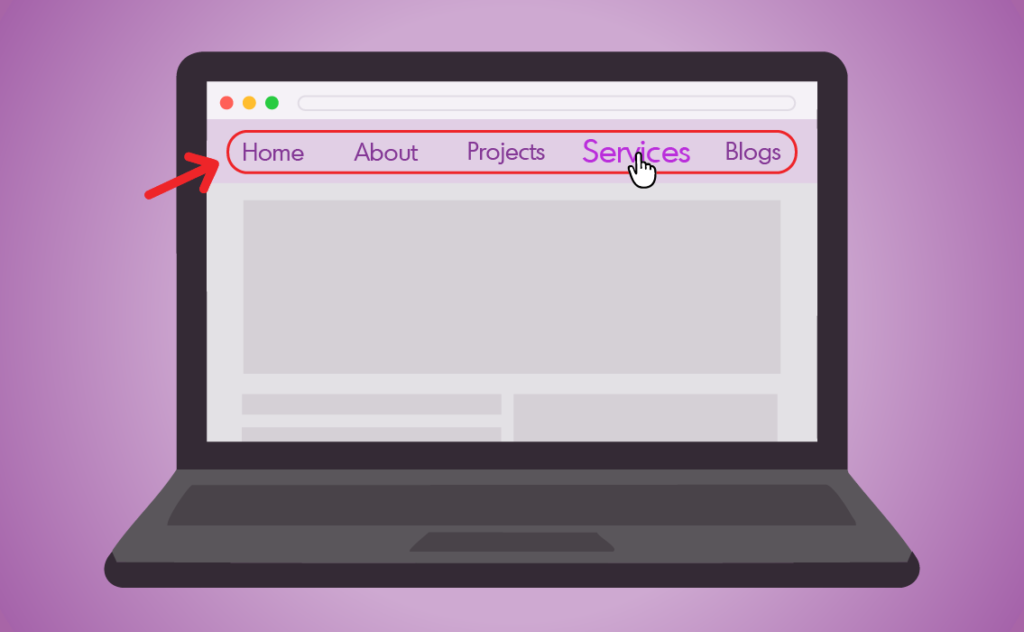
Top Navigation (Header Menu)
The most common design. Ideal for highlighting key pages such as Home, About, Services, and Contact.
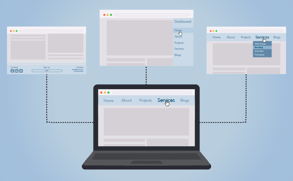
Footer Navigation
Holds secondary links like policies, FAQs, or social media. It gives visitors a way to continue exploring after scrolling to the bottom.
Sidebar Navigation
Appears along the left or right side of a page. It is useful for content-heavy sites or dashboards where quick access to multiple sections is important.
Breadcrumb Navigation
Shows users the path they took to arrive at a page. It reinforces orientation and makes it easy to return to higher-level sections.
Hamburger Menu
A three-line icon that opens a hidden menu, often used for mobile devices or minimalist designs.
Mega Menu
Displays multiple categories at once. This structure is common in e-commerce or large corporate sites where users need to browse many options.
Dropdown Menu
Reveals subpages under a main category. It keeps the design clean while maintaining easy access to deeper content.
Sticky Navigation
Keeps the main menu visible as users scroll. This design helps visitors move around quickly without needing to return to the top.
Full-Screen Navigation
Expands to cover the entire screen. It is often used for visual storytelling or bold, immersive layouts.
Card Grid Navigation
Displays clickable image tiles that link to pages. It works well for portfolios, galleries, or product listings.
Best Practices for Website Navigation Design

Creating effective navigation is about clarity, consistency, and simplicity. The goal is to help visitors find what they need without hesitation.
1. Don’t Overcomplicate
Keep your structure simple and predictable. Limit main categories to a small number and group related pages logically. Overloading menus with too many options can confuse visitors and lead to higher bounce rates. Clear organization helps users move naturally through your content.
2. Make Your Navigation Easy to Find
Place navigation where users expect it, usually at the top of the page or within a visible sidebar. Ensure that it stands out with clear labels, contrast, and consistent styling. Visitors should never waste time searching for the path forward.
3. Show a Navigation Path At All Times
Users should always know where they are. Breadcrumbs, highlighted menu states, or visual indicators help visitors understand their current position and easily retrace their steps. This sense of orientation builds confidence and improves usability.
Want to explore more practical design tips? See NN/g’s guidelines on menu design for additional insights on improving website navigation.
Conclusion
Website navigation transforms a collection of pages into a clear journey. It directs users through your content, builds confidence, and turns browsing into understanding. When visitors can move easily through your site, they focus on your message instead of how to reach it.
Think of navigation as your website’s built-in guide. It leads visitors where they need to go and makes their experience simple, memorable, and purposeful. Build it with clarity, and every click will feel like a step in the right direction.