When people think of web design, they often imagine colors, layouts, or images first. Yet if you look closely, most of what you actually see on a website is text. Fonts are not simply decoration. They set the tone, deliver meaning, and shape how we experience a brand. Typography is the quiet language of design.
Just as print materials rely on fonts to look professional, websites need typography to deliver both clarity and emotion. A good font can carry a brand’s identity and guide users smoothly through content, while a poor choice can make even the best design feel frustrating or unprofessional. Typography matters because it quietly influences how we read, how we feel, and how we remember a brand.
So why is typography so important in web design? There are three main reasons: branding, readability and accessibility, and visual hierarchy.
1. Branding
Typography has always been tied to branding, but until about 2010 designers had very limited options. Websites were restricted to a small set of “web safe” fonts that could display consistently across browsers. Even if a designer had a custom font that perfectly matched a brand’s identity, it could not easily be used online unless the user already had the font installed. As a result, customization was minimal and typography often felt secondary to other aspects of design.
Today the situation is very different. With tools such as Google Fonts, webfont generators, and advances in CSS, designers have access to thousands of typefaces. Brands that want to fully commit to their identity can even create a “font suitcase” to own the font itself. Purchasing or generating the font is often recommended over relying on subscription services like Adobe Fonts, since ownership ensures long-term control. A canceled subscription, for instance, should not be able to strip away the visual consistency of a brand overnight.
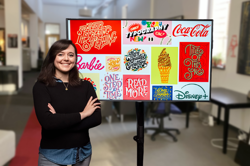
With so many options now available, brands must treat fonts as more than technical resources. Typography carries personality and communicates values. A handwritten style feels casual and approachable, while a sharp sans-serif communicates professionalism and modernity. Like logos and color palettes, fonts become part of how audiences remember and recognize a brand.
Consistency reinforces that memory. When a company uses different fonts across its website, brochures, and social media, it creates confusion rather than trust. Maintaining a unified typographic style ensures that recognition is immediate. For example, Target relies on Helvetica to signal clarity and simplicity, while Apple uses San Francisco to express sleekness and minimalism. These choices are not incidental but intentional reflections of brand identity.
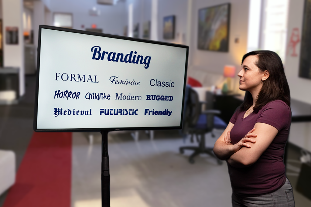
Typography also defines atmosphere. Fonts set the mood of a website before any words are read. A visitor can sense whether a brand feels formal, playful, modern, or traditional within seconds of landing on a page. Because of this immediacy, typography becomes one of the most powerful expressions of branding in web design.
Still, branding alone is not enough. A carefully chosen font can lose its impact if it sacrifices readability, accessibility, or hierarchy. These elements are essential companions to branding, and they ensure that typography not only looks good but also serves the user effectively.
2. Readability and Accessibility
Typography’s most essential job is to make words easy to read. If fonts are too small, crammed together, or blend into the background, visitors won’t stick around. They may leave not because the content is weak, but simply because it is hard to take in.
Readability goes beyond the choice of font itself. Line height, letter spacing, paragraph length, and even the amount of white space affects how smoothly the eye moves across the screen. When these elements are balanced, information flows naturally. When they are ignored, every sentence feels like effort.
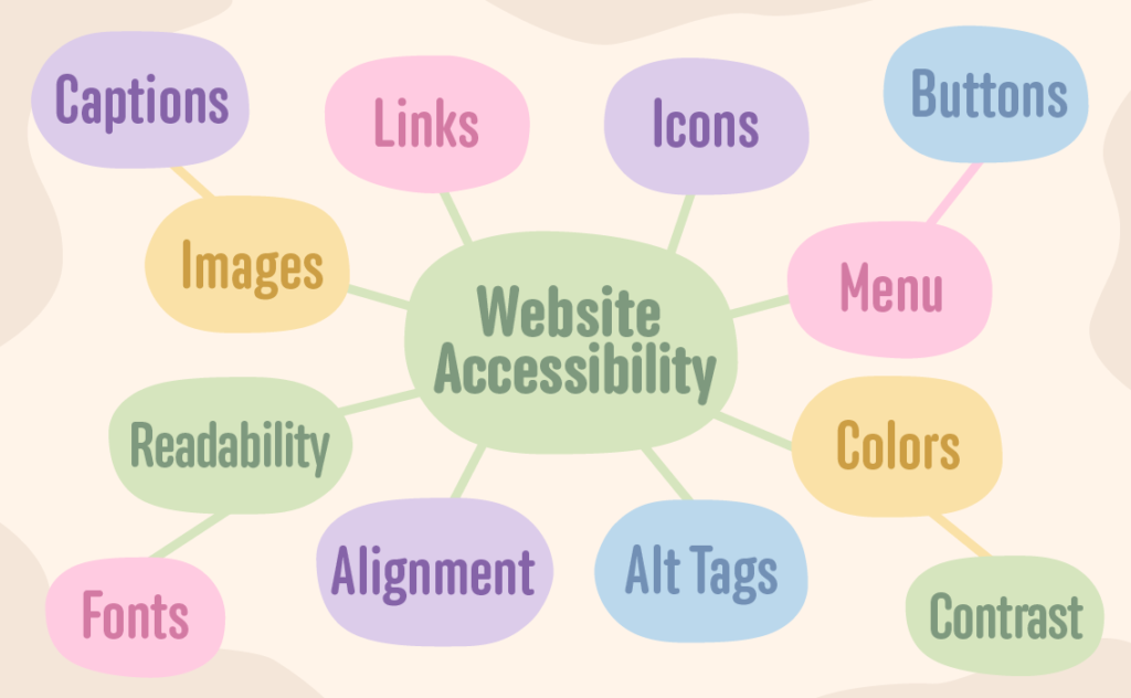
Accessibility adds another layer. Inclusive design isn’t optional anymore. A site that overlooks accessibility risks cutting out users with visual or cognitive challenges, and in some cases can even face lawsuits. Domino’s Pizza learned this the hard way when it was sued for failing to provide accessible online ordering.
Designers can take practical steps to improve accessibility: add alt text to images so screen readers can describe them, maintain strong contrast between text and background, avoid overly decorative fonts in body text, and scale fonts so they remain legible across both small and large screens.
3. Visual Hierarchy
Typography does more than make text readable. It organizes information. Think about what happens when you. First land on a webpage. Do your eyes immediately go to the headline? Does the page lead you smoothly from one idea to the next?
That sense of clarity comes from hierarchy.
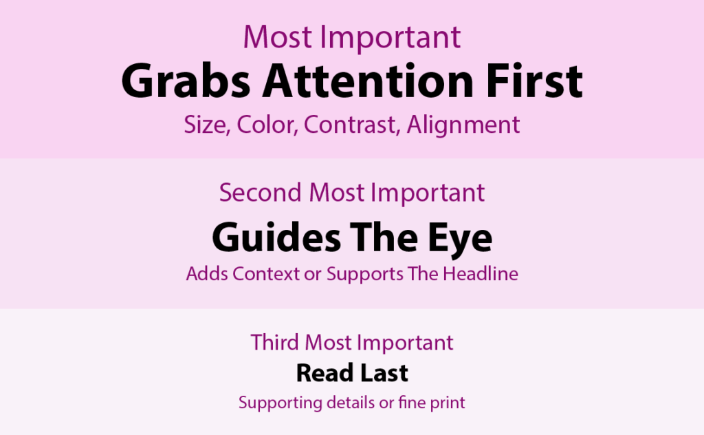
Differences in size, weight, and style act like visual road signs. Big bold headers grab attention. Subheadings make scanning easier. Body text delivers the details. Captions add context without distracting from the main flow.
This hierarchy also shows up in the code. HTML tags like <h1>, <h2>, and <h3> provide order for both readers and search engines. When design choices and coding structure align, websites feel intuitive and easier to navigate.
IH Concepts’ website and blog are a good example. Headlines, subheadings, body text, and captions each have their own style. The result is an organized, approachable page. Without those distinctions, visitors would just see a wall of uniform text.
Typography is not just aesthetic polish. It is guidance. Without hierarchy, even the strongest content risks overwhelming the reader.
Conclusion
Typography is often seen as a finishing touch in design, but in reality it is one of the foundations of a user’s experience. The fonts you choose guide the way people read your content, shape how they feel about your brand, and influence what they remember after they leave your site. Strong typography combines branding, readability, accessibility, and hierarchy into a consistent voice that carries across every platform where your brand appears.
The next time you choose a font for your website, remember that you are not just decorating a page. You are making a decision about how your brand speaks to the world and how your users experience that voice from the very first glance.