
Today, people communicate through websites, blogs, and social media more than ever before.
In the early days of the internet, designers had only a handful of web-safe fonts to choose from. Back then, beautiful typography was a privilege limited to print.
As the web evolved, digital type design flourished. Now, anyone can use stunning, optimized fonts with just a few clicks. Yet with this abundance comes a new challenge: deciding which typeface to use and how to use it well. Even subtle changes in letter spacing or line height can change how a message feels and how readable it becomes.
Typography sits at the heart of good web design. It shapes readability, emotion, and brand identity. Whether you are creating a landing page or a blog post, your font choice determines how easily visitors engage with your content and how much they trust your message.
What Is Typography?
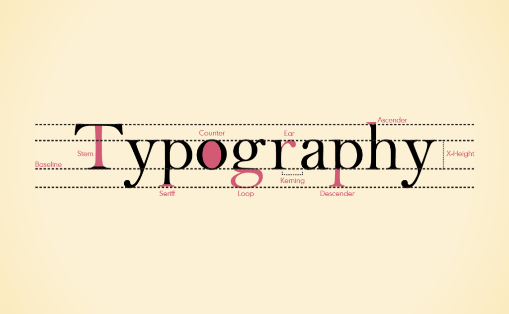
Typography is the visual system that gives written words structure and personality. It determines how text appears on the screen and how readers experience information.
Good typography involves balance and precision. It controls the relationship between size, spacing, and color to make reading comfortable and natural. In web design, typography also has a technical side, fonts must render smoothly across browsers and screen sizes while keeping performance in mind.
When typography is clear, visitors understand your message without effort. When it is confusing, they lose focus and move on.
What Factors Should You Consider When Choosing Fonts?

Choosing fonts can feel incredibly overwhelming, but there are many ways to break that decision down into bite-sized ones that can help you rationalize and find the perfect fit. There are many considerations you should think about when choosing fonts for your website. These will help you find the perfect font for your website that showcases who you are without giving up any functionality.
Brand Identity
Fonts express who you are as a brand. A clean sans-serif communicates modernity and efficiency. A serif font conveys reliability and tradition. A handwritten or decorative typeface adds personality but can easily become overwhelming.
Choose fonts that reflect your tone and audience. A brand that focuses on innovation may prefer geometric fonts, while a hospitality business might lean toward soft, rounded forms that feel approachable.
Readability and Legibility
The most beautiful typeface fails if it is difficult to read. Readability concerns long sections of text, while legibility refers to how easily readers can recognize each letter.
For web design, body text should generally be 16 pixels or larger. Wider line spacing, around 140 percent of font size, makes paragraphs easier to scan. Avoid cramming text together, and maintain strong color contrast for accessibility.
Typography should help users move through content. A well-spaced, consistent type system keeps eyes relaxed and attention focused.
Browser Compatibility
Fonts do not always appear identical across browsers. Test your design on Chrome, Safari, and Firefox to ensure your typography looks consistent. Use web-safe or hosted fonts from trusted services such as Google Fonts or Adobe Fonts to maintain quality and reliability.
Mobile Compatibility
Users read on screens of all sizes, so responsive typography is essential. Avoid thin or overly narrow fonts on mobile. Ensure that text resizes smoothly, remains legible in both dark and light modes, and adjusts naturally when viewed vertically or horizontally.
Popular Font Choices
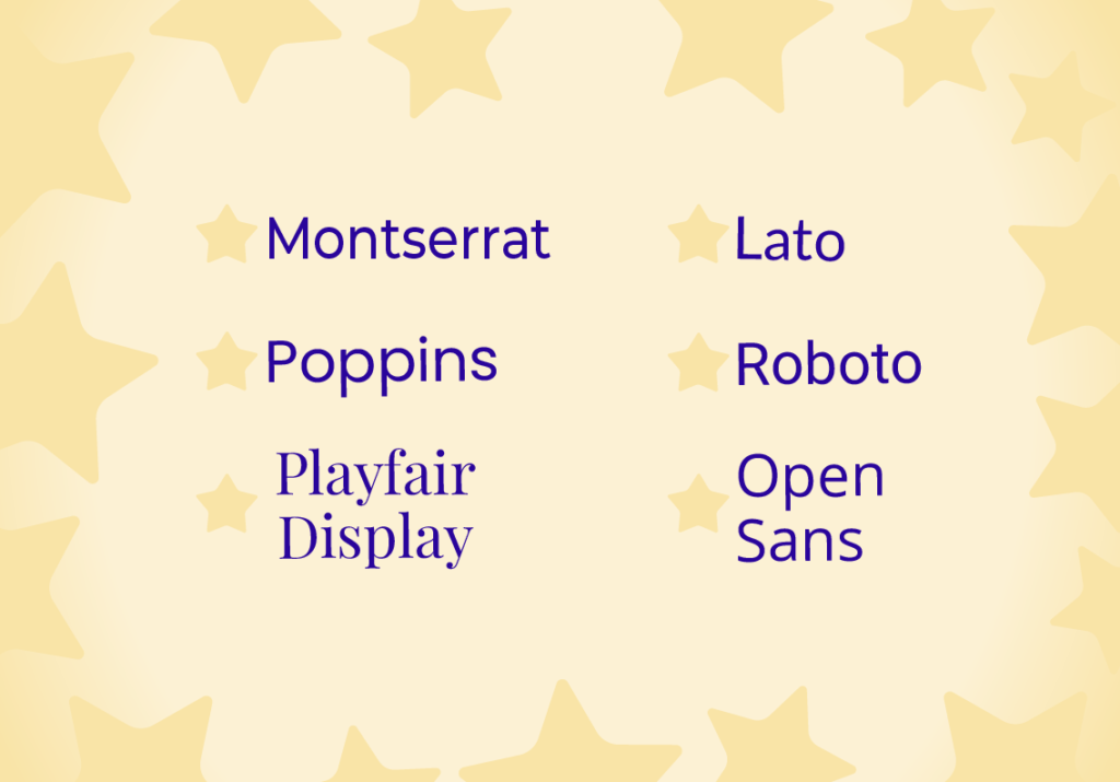
There are some fonts that stand out as popular choices among businesses for websites, listed below are various categories of fonts with popular choices within those groups, these examples can help you get an idea of what kind of font you may want to use dependent on what kind of vibe you want to express.
Top Sans-Serif Fonts
Sans-serif fonts like Open Sans, Lato, Roboto, and Helvetica Neue create a simple, modern impression. They perform well on screens and suit professional websites and interfaces.
Top Serif Fonts
Serif fonts such as Georgia, Merriweather, and Playfair Display bring a sense of stability and elegance. They are often used in editorials or corporate sites that value tradition and readability.
Unique Fonts
Distinctive typefaces such as Poppins, Raleway, or Montserrat add character while keeping text easy to read. Use them selectively for titles or featured phrases to create emphasis without overwhelming your layout.
For more ideas and examples, explore Figma’s Best Fonts for Websites.
Pairing Fonts: How to Complement Two Fonts

Utilizing a single font limits your ability to fully use contrast and hierarchy. By pairing fonts, your website can highlight critical information, create sections for easy navigation, and allow greater expression of your brand. Its important to choose font pairs purposefully, to ensure they aren’t fighting for attention or clashing on your site. With the tools and tips below, you’ll be able to effectively find your perfect pair.
What Makes an Effective Font Pairing?
A strong pairing creates visual hierarchy and contrast. Use a bold, attention-grabbing font for headings and a simple, neutral one for body text. The combination should feel natural, with clear differences in weight, proportion, or spacing.
Consistent use of headings, subheadings, and body text helps readers scan quickly. Most visitors skim rather than read word for word, so clear visual hierarchy improves comprehension and engagement.
Tip: Keep interactive elements such as buttons and navigation text within the same font family. This consistency makes your design feel polished and trustworthy.
Tools for Font Pairing
Designers can explore helpful resources such as FontPair.co, which offers Google Font pairings by style for quick inspiration, and Adobe Fonts, a professional library with built-in pairing recommendations that integrate seamlessly with Creative Cloud tools. These platforms make it easy to experiment and find combinations that fit your brand.
Adding Fonts to Your Website

Now that you have selected your fonts, its time to implement them on your site! It may sound complicated, but there are many tools and reminders available to make that process easy, making sure you can legally and painlessly implement them is key in finalizing your font choice.
Using Web Fonts
Most websites today use hosted fonts to ensure stability and fast performance. Services such as Google Fonts and Adobe Fonts let you embed fonts directly into your site without worrying about compatibility.
Keep performance in mind. Large font files can slow loading times. Limit the number of weights or styles and optimize your files to balance design and speed.
Complying with Licenses and Copyright Law
Before using any font commercially, review its license. Some fonts are free for personal use but require payment for business purposes. Following license terms protects your brand and supports the designers who create the fonts you use.
Conclusion
Typography defines how people read and connect with your content. The right font makes your website feel professional, welcoming, and easy to navigate. Clear spacing, consistent hierarchy, and strong contrast guide the reader through each section.
When typography works well, users spend more time exploring and engaging with your message. It enhances every part of design, from emotion to usability, and turns simple words into a complete experience.
Want to learn how typography decisions shape the user experience?
Revisit our blog Why Typography Matters in Web Design for practical design insights.
External source links
https://www.w3schools.com/css/css_font_websafe.asp